Creating CSS flip cards is not only an incredible space saver on websites but they also look cool and can lead to greater engagement and user experience. They are also easy to create.
The Demo
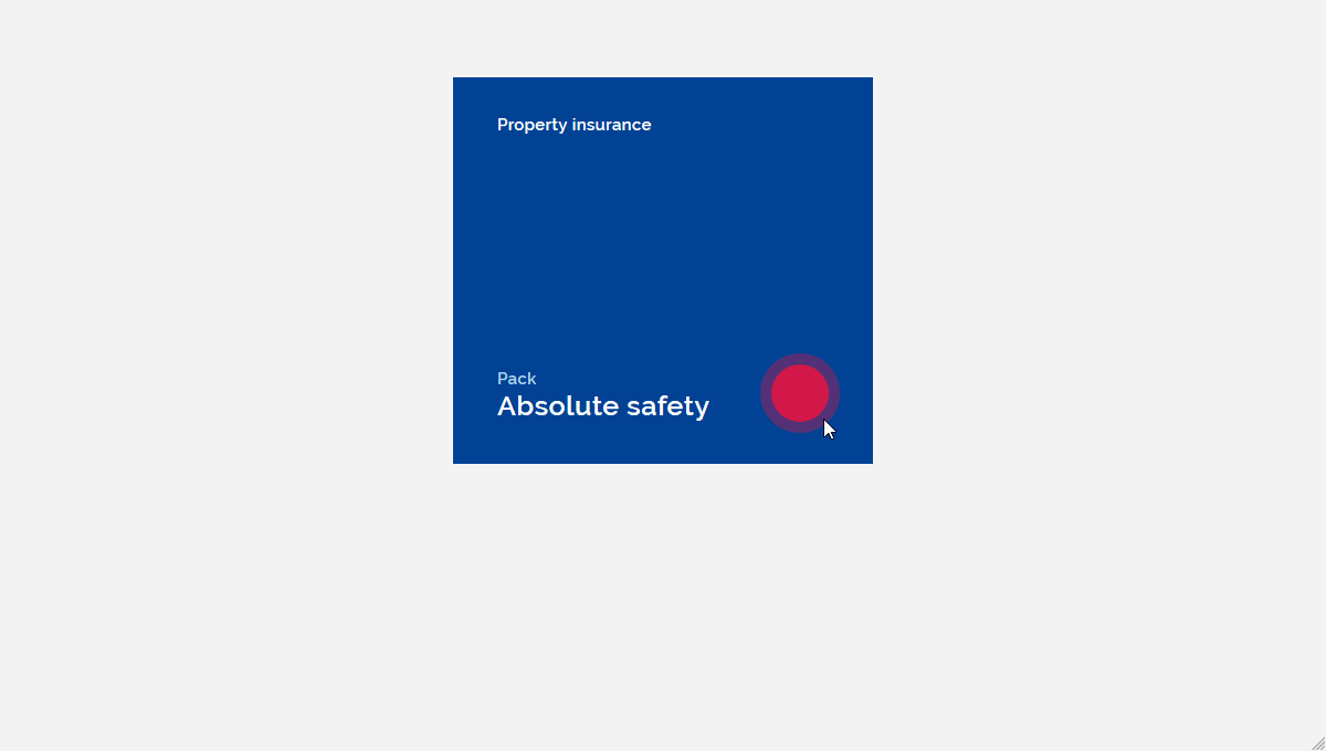
Below is a snippet of the flipping animation effect that we will be making.
See the Pen CSS Flipping Animation by Davison Pro (@davisonpro) on CodePen.
The HTML
The HTML structure to create the two-sided flipping animation effect is as you would expect it to be:
There are two content panes, “front” and “back”, as you would expect, but also two containing elements with very specific roles explained by their CSS.
The CSS
Here’s a rough overview of the process:
- The container holds all our elements and positions the card in the center of the screen. This is done by using flexbox.
- The card element holds the front and the back of the card and also controls the card hover action via the hover pseudo-class.
- The card element has a
transform-style: preserve-3dCSS property. If we take away the preserve 3d value all we get is a reverse of the front element. The back doesn’t show because we don’t have the 3d layer.
Think of it like a sandwich with two slices of bread. One at the top and one at the bottom. Without preserved 3d we only flip the top slice back and forth. With preserved 3d we flip the entire sandwich.
- The back element is the back facing side of the card that shows when the user hovers over the card. The hover pseudo-class controls the flip effect.
- The front element is the front facing side of the card that shows by default.
- The front and back elements of the card are positioned absolutely so they can “overlay” each other in the same position; We don’t want one side of the card to be on top of the other. Their
backface-visibilityis hidden so the back of the flipped elements don’t display during flip animation.
- The front element of the card has a higher
z-indexthan the back element so that it displays on top.
- The CSS
backface-visibilityproperty is used to determine whether the back of an element is visible when it has been rotated and its back is facing the user. When the back face visibility is visible the front and back of the card will conflict and cause a flicker that ruins the flip effect.
That’s really all there is to it! Put this simple structure into place and then style each side as you’d like!
Achieving the CSS flipping effect is quite simple. Give it a shot and see how it works and you can also use this effect on your website gallery. If you have any questions leave please ask in the comments section below. Happy coding!